

Overview
What is Sayaraa?
Sayaraa is a car service marketplace in Abu Dhabi (UAE), connecting customers with service stations and garages. I worked remotely as a product designer on a contract basis, focusing on the car wash experience across information architecture, booking flows, and recurring package journeys.
I had previously worked on an early version of the product, which gave me historical context into how initial design decisions impacted usability and scalability over time. This redesign was an opportunity to re-evaluate those decisions with stronger product judgment and real-world constraints.
My Role
Product design
and strategy
Industry
Automotive
Team
Founder
Product Manager
Frontend Engineers
Backend Engineers
Project Type
Contract
Remote
Timeline
1 Month
Problem Context
Improve Car Wash Discovery & Booking Experience
Improved the information architecture, streamlined car wash booking flows, and refined the package experience for recurring services.

Why Improve the Experience?
In 2021, as COVID-19 restrictions eased, demand for car wash increased significantly across the UAE. While competing platforms were seeing higher engagement, Sayaraa struggled to generate bookings and product orders.
📉
Low booking completion despite increased service demand
🏆
Competitors capturing a larger share of service bookings
📊
Limited conversion from existing app users
Strategic Focus
I focused on the car wash journey from service discovery to booking, with particular attention to the recurring package experience.
Car Wash
Package-based and one-time booking experience
Car Services & Products
Service booking & auto parts purchasing
Discovery and Analysis
Auditing the Existing Car Wash Experience
To understand the factors contributing to low booking completion, I evaluated the end-to-end car wash journey, from provider discovery to booking, using flow analysis, usability principles, and existing user feedback.
🔍Key Findings
The audit revealed usability issues across provider discovery, booking configuration, and price visibility.

**The flow was mapped from the existing experience; post-selection screens weren't available for visual documentation.
Before Vendor Selection & Configuration
Discovery Was Fragmented Before Users Could Choose a Vendor
Users encountered unclear provider information, repeated navigation, and promotional distractions before selecting a vendor. This made it harder to compare options and move confidently from service-mode selection to vendor discovery.


After Vendor Selection & Configuration
Booking Configuration Lacked Clarity and Continuity
After selecting a vendor, users faced repeated configuration steps, ambiguous field labels, and limited pricing context. The flow lacked clear progression and guidance for reviewing selections and moving toward checkout.


Introduced a Refined Visual Language
Reduced visual clutter to improve readability and reduce cognitive load.
Strengthened visual hierarchy and accessibility across key interactions.
Established a more consistent, competitive interface aligned with modern automotive service experiences.
Exploring the Flow Before Finalizing the Design
I sketched early concepts to explore service selection, wash configuration, checkout, and package booking. These explorations helped me work through the information architecture and key interactions before translating the flow into the final interface.

Solution
Clear Entry Point with Pricing Clarity
I restructured the entry point around service mode, allowing users to choose between station-based and doorstep car washes before exploring relevant vendors.
Starting prices and estimated durations help users compare options upfront, while provider listings surface ratings, locations, and pricing to support more informed decisions.

Why Service Mode First?
I made service mode the entry point because not every vendor offers both station-based and doorstep washes. This filters vendors by service availability and surfaces starting prices and estimated durations upfront.
🚗
Distinct Service Modes
The two modes represent different service experiences.
🎯
Relevant vendors
Not every vendor offers both modes.
🔀
Fewer Navigation Loops
Deleted the extra step of vendor rediscovery

Trade-offs in Choosing the Entry Point
⚙️
Service mode first (chosen approach)
Filters vendors by the user's preferred experience
Sets expectations early
Avoids showing incompatible vendors
🧑🔧
Vendor first
Lets users explore vendors before committing to a mode
Can make vendor comparison feel more open
May introduce an extra step if the vendor doesn't offer the desired mode
Car Wash at Station
A Clearer Path From Configuration to Checkout
Users can select their vehicle, choose a wash type, and review service details and pricing before proceeding to checkout. Making each step easier to understand and follow.


Car Wash at Doorstep
Added Clear Steps to Select a Location and Schedule Booking
Structured the booking flow into clear steps for selecting a service location, vehicle, wash type, and preferred date and time—making doorstep bookings easier to configure.

Why Package CTA is Prominent?
Packages were given prominent placement to encourage recurring purchases for Sayaraa and vendors. The challenge was to promote packages without disrupting the direct wash-booking journey.
Simplified Package Discovery, Purchase & Usage
From discovery to usage of the package defined the clear logic of the flow for both the station and doorstep services


Designed for the Entire Package Lifecycle
Users can track remaining washes, review their usage history, and request another booking. Expiry and low-balance reminders help them stay informed throughout the package's validity.


Previous Version Lacked Package Visibility & Reminders
Users had to navigate to My Orders to check package status, making it harder to discover active packages, track remaining washes, and notice upcoming expiry.
Home → My Orders → Packages → Request Booking
Introduced Package Status on the Home Page
Surfaced active packages, low remaining washes, and upcoming expiry directly on the home screen, helping users track package status without navigating to My Orders.
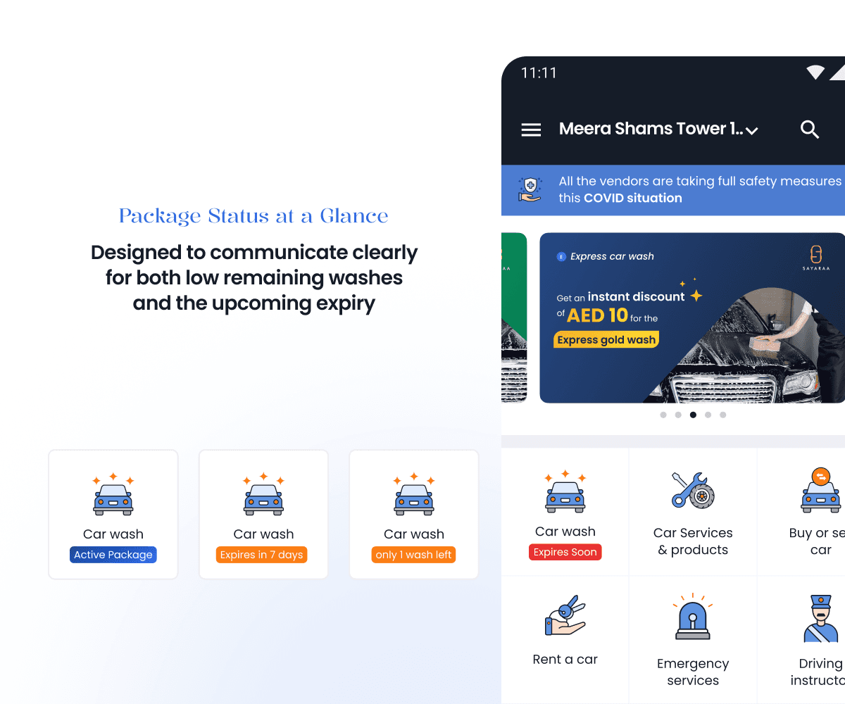
We initially explored a contextual package reminder on the home screen, but stakeholder feedback led us to adopt a less intrusive, feature-specific approach.


Results
Projected Outcomes
With no post-launch analytics available, these outcomes represent the intended impact of the redesign rather than measured results.
📉
Reduced friction across vendor discovery and wash configuration.
✅
Improved visibility of package pricing, validity, and remaining washes.
🧭
Easier access to package status and repeat booking.
Key Learnings
What I've Learned from this?
Service availability should shape the discovery flow from the start.
Package purchase and wash booking are separate journeys that must remain connected.
Reminder visibility must be balanced against the discoverability of other features.